 Français
What are links
Links create hyperlinks to web pages, files, email addresses, locations in the same page, or anything else a URL can address.
How Are Links Different From Buttons
Buttons are interactive elements that are activated by a user with a mouse, keyboard, finger, voice command, or other assistive technology. Once activated, it then performs an action, such as submitting a form or opening a dialog.
How People with Disabilities Use Links
- Screen reader users: rely on software that reads digital content aloud. When navigating websites, they use keyboard shortcuts to jump between links. Properly labeled links (with descriptive text rather than vague phrases like "click here") are crucial for these users to understand the purpose of each link. Screen readers also provide a list of links on a page, so clear and descriptive naming helps users find the desired link quickly.
- Users with motor disabilities: especially those who might have difficulty using a mouse, often rely on keyboard navigation. They use tab keys to move through elements on a page, including links. Therefore, it's essential that links can be accessed and activated using the keyboard alone. Additionally, links should have adequate spacing and be sizable enough to make selection easier for users with limited fine motor control.
- Users with vision deficiencies: might use screen magnification tools or custom color settings to read links. Ensuring high contrast between link text and its background, and underlining links, can make them more discernible. Avoid relying solely on color to indicate links; text style changes (like underlines) are helpful. It’s also important to ensure that links are clearly visible and distinguishable when the page is zoomed in, as these users often browse with significant magnification.
- Speech Recognition Users: navigate the web differently than those using traditional input methods. They interact with links by speaking commands, such as the text of the link or a number assigned to it. For these users, it's crucial that links have clear, concise, and unique text. Links with ambiguous or generic text like "read more" can be confusing when using voice commands. Additionally, websites should be designed to minimize the likelihood of speech recognition errors, which can be more common with links that have complex or very similar names.
- Users with cognitive disabilities: which can include a wide range of challenges such as memory issues, attention deficits, or dyslexia, web navigation can be particularly daunting. Simplified language and clear, logical structure in link text are beneficial. Links should directly convey their purpose without requiring users to understand complex terminology or read lengthy descriptions. Consistent placement and design of links across a website can also aid in navigation, as it creates a predictable pattern for users to follow. Providing alternative navigation methods, such as a search function or a site map, can also be helpful for users who may struggle with traditional link-based navigation.
Types of Links
Same Page Links (Anchor Links)
Same page links, commonly known as anchor links, are used to navigate to specific sections within the same webpage. This is particularly useful for lengthy web pages, allowing users to quickly jump to the desired content without scrolling.
The mechanism involves two parts: the link itself and the target section. The link uses an href attribute with a hash (#) symbol followed by an identifier, which is the id of the target element on the same page.
When clicked, the browser scrolls to the element with the corresponding id. This technique enhances user experience, especially in content-rich pages like articles, documentation, or FAQs. The IDs used must be unique within a page to ensure correct navigation.
Example:
<!-- Link to the section -->
<a href="#section1">Jump to Section 1</a>

<!-- Target Section with an ID -->
<h2 id="section1">Section 1</h2>
Internal links
Internal links are hyperlinks that point to another page within the same domain. These links are fundamental to website navigation, allowing users to explore different pages like 'Home', 'About Us', or 'Contact'. Internal links can use either absolute paths (which include the full URL) or relative paths (which relate to the current page's URL). They play a crucial role in website organization and usability, and also contribute to SEO by establishing site architecture and spreading link equity.
Example:
<!-- Relative path -->
<a href="/blog">Includia Blog</a>

<!-- Absolute path -->
<a href="https://includia.com/blog">Includia Blog</a>
Links that open a new window or tab
External links typically direct users to a different domain, and can significantly impact users with disabilities:
- Disorientation for Screen Reader Users: Screen readers may not automatically inform the user that a new window or tab has opened. This can lead to confusion, as users might struggle to navigate back to the original context.
- Challenges for Users with Cognitive Disabilities: Sudden changes in context, like a new window or tab opening unexpectedly, can be disorienting for users with cognitive disabilities. It disrupts the linear browsing experience and can cause frustration or loss of concentration.
- Difficulties for Keyboard-Only Users: Users who navigate using a keyboard may find it challenging to manage multiple windows or tabs. It requires additional keystrokes and can complicate the navigation process.
Implementation Guidelines for Accessibility
- Clear Indication: Visually indicate that a link opens in a new window or tab. Icons or text like "(opens in a new window)" can be used. Ensure this indication is also accessible to screen reader users by using appropriate ARIA labels or off-screen text.
- Advance Warning in Link Text: Include information in the link text or adjacent text indicating that it will open in a new window or tab. For example, "Read our blog (opens in a new window)".
- Use of
target="_blank"andrel="noopener noreferrer": While usingtarget="_blank"to open links in a new tab, also includerel="noopener noreferrer"for security and to prevent performance issues. - Consistent Behavior: Apply a consistent strategy across your website for links that open in new windows or tabs. This helps users anticipate the behavior and navigate more confidently.
- Option to Open in Same Window: Where feasible, provide users with the choice to open links in the same window or a new one. This can be achieved through user preferences or alternative link options.
- Keyboard Navigation Support: Ensure that users can easily navigate back to the original window or tab using keyboard shortcuts. Provide instructions or guidance if necessary.
Example:
<a href="https://vde.includia.com" target="_blank" rel="noopener" aria-label="Vision Deficiency Emulator, Opens in a new window">
  Vision Deficiency Emulator
</a>

Text Fragment Links
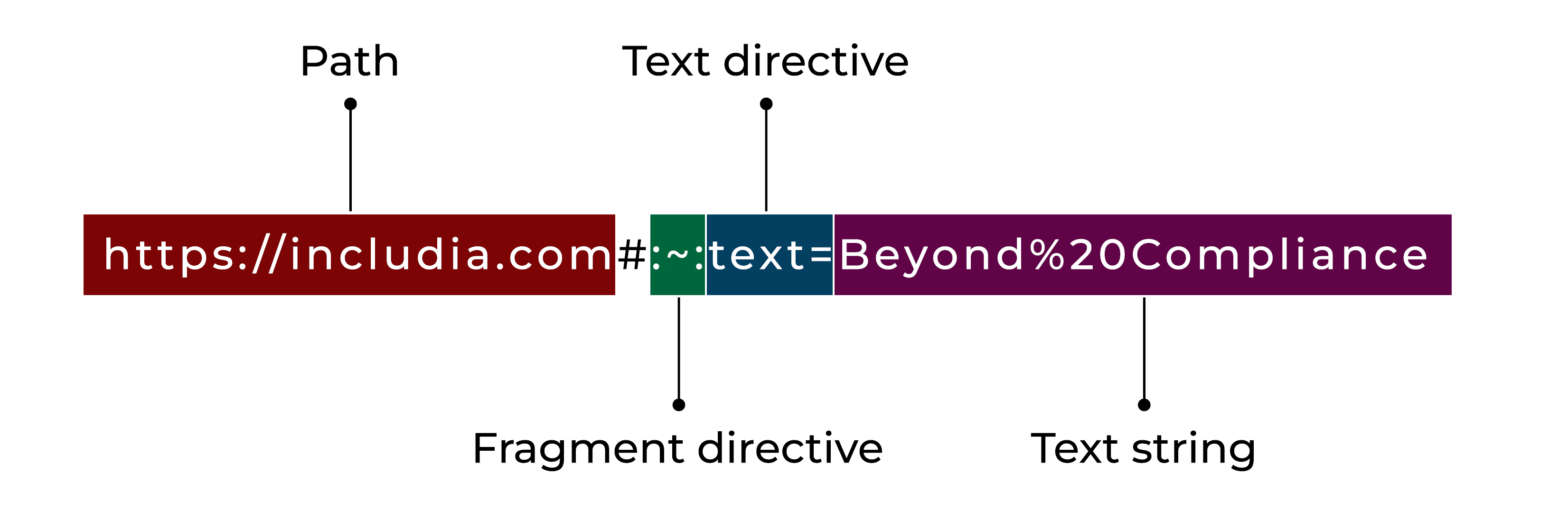
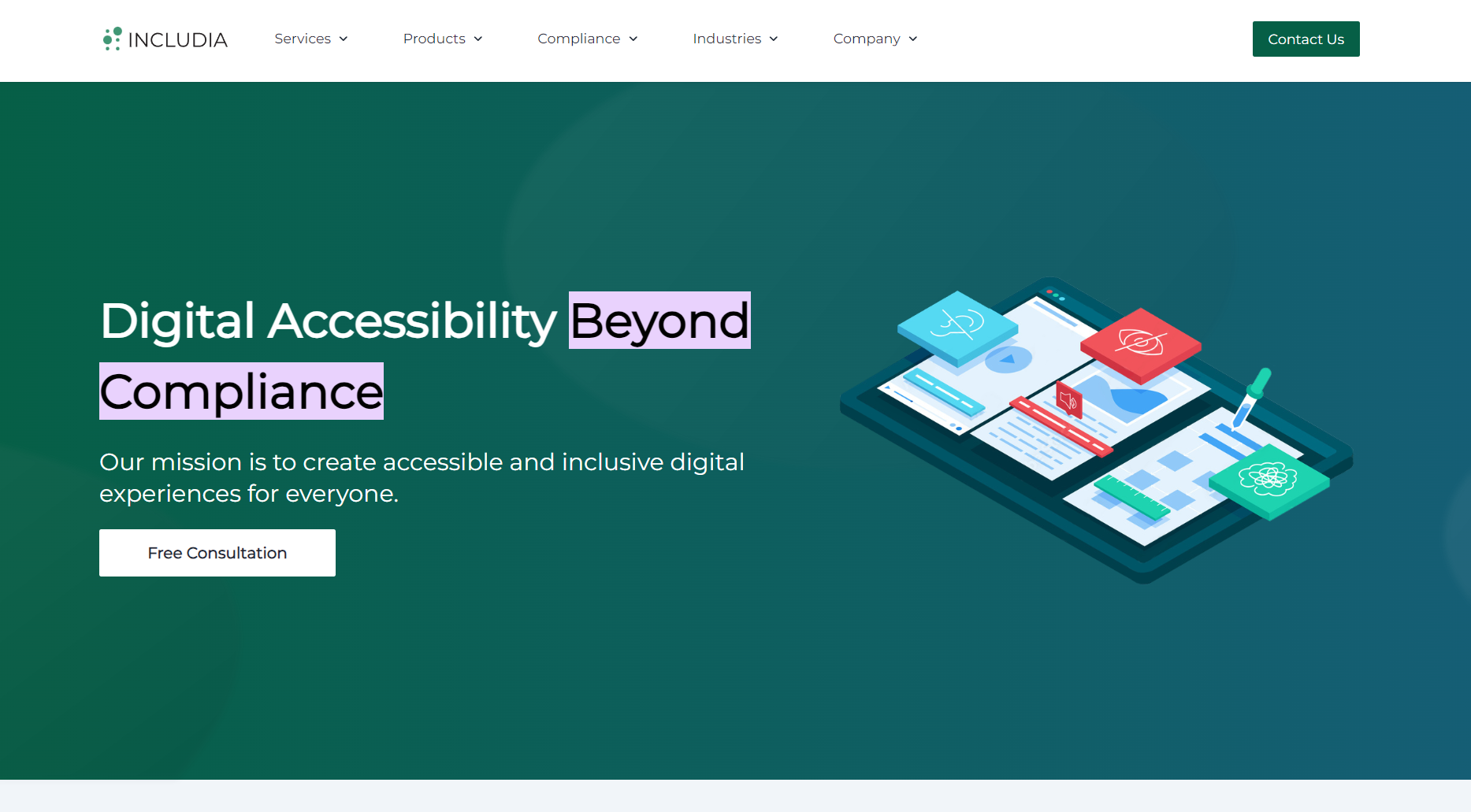
Text fragment links are a relatively new addition that allows linking to a specific part of the text on a webpage. These links specify a snippet of text in the URL fragment, using the format #:~:text=. When such a link is opened, the browser not only navigates to the page but also highlights the specified text. This feature is incredibly useful for directing users to exact information within long pages, enhancing the precision of information sharing.
Example:
<a href="https://includia.com#:~:text=Beyond%20Compliance">Includia's hero title</a>
In this example, when the user clicks on the link, the browser will navigate to the 'Includia' page and specifically highlight the phrase "Beyond Compliance" drawing the user's attention directly to that section.
Link to files
Linking to files is a common practice on websites, allowing users to access various types of content such as documents, images, audio, and video files. When a user clicks on a link to a file, the file can either be displayed within the browser (if the browser supports that file type) or prompt the user to download the file to their device.
Key Considerations:
- File Type and Browser Compatibility: Some file types like PDF, JPEG, or PNG are typically viewable directly in the browser. However, others might require specific software to open.
- Informing the User: It's good practice to inform the user about the file type they are about to open or download.
Example:
<a href="/documents/guide.pdf" aria-label="User Guide (PDF, Opens in a new window)" target="_blank">User Guide (PDF)</a>
Download links
Download links are designed to prompt the user to download a file instead of opening it in the browser. The download attribute in the <a> tag suggests that the linked resource should be downloaded upon clicking. This is particularly useful for downloadable content like software, PDF guides, or other resources that users might want to save locally.
An important aspect of creating accessible download links is to include clear information about the file type and size. Mentioning the file type (e.g., PDF, DOCX, JPEG) helps users understand what software they might need to view the file. Additionally, providing the file size (e.g., 2.6MB) is very useful to users with limited bandwidth or data plans, as it allows them to make informed decisions about whether to download the file based on their current internet data usage constraints.
Example:
<a href="/files/montreal-metro-map.pdf" download>Download Montreal metro map (PDF - 2.6MB)</a>
In this example, users are informed that the link will initiate a download of a PDF file, and they are aware of the file's size, which enhances the transparency and usability of the download link.
Email address links
Email address links use the mailto: scheme to create hyperlinks that open the user's default email client with a pre-populated recipient address. These links can also include subject lines or body text. They are widely used on contact pages, allowing users to conveniently initiate communication with a single click.
Example:
<p>
  Email Includia at:
  <a href="mailto:contact@includia.com">contact@includia.com</a>
</p>
Phone number links
Phone number links, enabled by the tel: scheme, allow users to initiate a phone call directly from a webpage. This is particularly useful in mobile web design, as it offers a seamless way for users to contact businesses or individuals. The link opens the phone's dialer with the number pre-filled, simplifying the user's effort to make a call.
Example:
<p>
  Call us at:
  <a href="tel:+1234567890">1234567890</a>
</p>
SMS Links
SMS links, similar to phone number links, use the sms: scheme to enable sending a text message. By clicking on these links, the user's messaging app opens with the phone number and, optionally, a pre-written message. This type of link is useful for businesses encouraging quick text inquiries or for providing a convenient way for users to request information.
Example:
<p>
  Send us a message at:
  <a href="sms:+1234567890">1234567890</a>
<p>
Providing Clear and Concise Link Text
Clear and concise link text is a crucial aspect of web accessibility. It involves using descriptive and succinct text in hyperlinks that clearly communicate the purpose and destination of the link. This practice is essential for all users, but especially so for those using screen readers and other assistive technologies. Effective link text helps users understand where a link will take them without requiring additional context from surrounding content.
Impact of Link Text on Accessibility
- Improved Navigation for Screen Reader Users: Users who rely on screen readers often navigate by jumping from link to link. Clear link text helps them understand their options without needing to read the surrounding text, making navigation more efficient and less confusing.
- Enhanced Comprehension for Cognitive Disabilities: Individuals with cognitive disabilities benefit from straightforward, unambiguous link text. It reduces the cognitive load required to understand the links, facilitating easier web navigation.
- Efficient Scanning for All Users: Many users scan web pages for relevant information rather than reading every word. Clear link text allows these users to quickly find and understand the links they need, improving the overall user experience.
- SEO Benefits: Descriptive link text can also contribute to search engine optimization (SEO) by providing more context to search engines, aiding in better indexing and ranking of web pages.
Best Practices for Link Text
- Descriptive Text: Use link text that adequately describes the link's destination. For example, "Download the Accessibility Guide" is more informative than "Click here."
- Avoid Ambiguity: Refrain from using vague link text like "click here" or "more." Such text requires users to seek additional context to understand the link's purpose.
- Contextual Relevance: Ensure that the link text makes sense out of context, as screen reader users might navigate links as a list, separated from surrounding content.
- Brevity: While being descriptive, keep the link text concise. Lengthy link text can be cumbersome, especially for users navigating with screen readers.
- Unique Text for Different Links: Avoid using the same link text for links leading to different destinations. Each link should be uniquely identifiable.
- URLs as Link Text: Generally, avoid using URLs as link text unless necessary. URLs are often not human-readable and can be challenging for screen readers to interpret.
Using the title Attribute
The primary goal of this technique is to illustrate the effective use of the title attribute in anchor <a> elements to provide supplementary text that clarifies or elaborates on the purpose of a link. The title attribute serves as a tool for offering additional insights or explanations regarding the link's function or destination.
Importance of Contextual Information in Title Attribute
- Clarification and Description: The
titleattribute plays a crucial role in enhancing the understanding of a link, especially when the link text itself may not fully convey the link's purpose. It can be particularly useful in adding context to links with generic text like "Click Here" or "Read More." - Pre-Click Information: If the additional information in the
titleattribute includes essential details that the user needs to know before clicking the link (e.g., warnings or critical descriptions), this information should ideally be included in the link text itself. Thetitleattribute should complement, not replace, the primary descriptive text of the link.
Caution in Using the title Attribute
- User Agent Limitations: Due to significant variability in how different browsers and assistive technologies interpret and present the title attribute, reliance on this attribute for conveying critical information should be approached with caution.
- Accessibility Considerations: Not all users, particularly those using screen readers or keyboard navigation, can access or perceive the additional information provided by the title attribute. This limitation necessitates that the title attribute be used judiciously and not as the sole method of providing important link-related information.
Best Practices for title Attribute Usage
- Supplemental Use: Employ the title attribute to supplement the existing link text, offering extra context or details that enhance user understanding without being essential to the basic comprehension of the link's purpose.
- Avoiding Redundancy: Refrain from merely repeating the link text in the title attribute. Instead, use it to provide value-added information that contributes to a more informative user experience.
- Brevity and Relevance: Keep the title attribute content concise and directly relevant to the link. Overly lengthy descriptions might not be fully accessible or beneficial to all users.
Broken Links
Broken links, often referred to as "dead links," are hyperlinks that lead to pages or resources that are no longer available or cannot be found. They can occur for various reasons, such as moved or deleted content, changes in URL structures, or server issues. From an accessibility standpoint, broken links present unique challenges, especially for users with disabilities.
Broken Links Impact on Accessibility
- Navigation Disruption: For users relying on screen readers or keyboard navigation, encountering a broken link can be particularly disorienting. These users might have difficulty returning to the previous page or understanding why the content is unavailable.
- Increased User Frustration: Encountering broken links can lead to frustration for all users, but this is especially true for those with disabilities who may take longer to navigate websites. The additional time and effort spent reaching a dead end can be discouraging and tiresome.
- Loss of Trust and Confidence: Frequent encounters with broken links can diminish a user's confidence in the website. This is particularly detrimental for users with disabilities who depend on the reliability of a website for accessible information and services.
- Compromised Information Access: For users who depend on websites for critical information or services, broken links can result in the inability to access necessary resources, impacting their autonomy and independence.
Best Practices for Addressing Broken Links
- Regular Audits and Monitoring: Conduct regular checks on your website to identify and fix broken links. Automated tools can help in scanning for dead links across your site.
- Clear Error Messaging: In cases where a link leads to a non-existent page, ensure that the 404 error page is informative and provides options to navigate back to the main site or to other relevant pages.
- Alternative Access to Information: Where possible, provide alternative ways to access the information or resources that the broken link was supposed to lead to. This could include updated links, directions to find the moved content, or search functionality.
- User Feedback Mechanisms: Implement a system for users to report broken links easily. This not only helps in maintaining the site's integrity but also involves users in the process of making your website more accessible.
Hidden Links
Hidden links are hyperlinks embedded in a webpage that are not visible to most users but can be present in the page’s code. These links might be hidden using various techniques such as setting the font size to zero, using a color that blends into the background, or positioning them off-screen. While there can be legitimate reasons for hiding links (like improving mobile user experience or for SEO purposes), they can also be used for deceptive practices.
Hidden Links Impact on Accessibility
- Confusion for Screen Reader Users: Screen readers read out all links, including those that are visually hidden. This can lead to confusion for visually impaired users, as they encounter links that are not apparent to sighted users. It can be disorienting and frustrating when the context of these links is unclear.
- Inconsistent User Experience: Hidden links can create an inconsistent experience between users who rely on visual cues and those who use assistive technologies. What might be a streamlined experience for sighted users could be a complex and confusing navigation maze for those using screen readers.
- Potential for Misuse: Sometimes, hidden links are used for dubious purposes, like manipulating search engine rankings. Users with disabilities might inadvertently interact with these links, leading them to irrelevant or malicious content.
- Difficulty in Navigation: Users who rely on keyboard navigation might find themselves tabbing through invisible elements. This not only creates confusion but also makes the navigation process more time-consuming and difficult.
Best Practices for Managing Hidden Links
- Legitimate Use: If hiding links is necessary (for example, in responsive designs where certain elements are hidden in different views), ensure that these links are also hidden from screen readers by using
aria-hidden="true"andtabindex="-1"to remove it from keyboard navigation. - Clear Context and Navigation: For legitimately hidden links that are necessary for screen reader users, provide clear context. Make sure that the purpose of the link is understandable even if it's not visible visually.
- Avoid Deceptive Practices: Refrain from using hidden links for deceptive SEO practices or to trick users. Such practices can harm not only accessibility but also the credibility and security of your site.
Link Non-Color Indicators
Relying solely on color to distinguish links can create barriers for users with color vision deficiencies. Non-color indicators, such as underlines or font style changes, are essential to ensure that links are perceivable by all users, regardless of their ability to discern color differences.
- Visibility for Color Blind Users: Users with color vision deficiencies might not distinguish links from regular text if the only difference is color. Non-color indicators make links visible to these users.
- Clarity for Users with Low Vision: Non-color cues can help users with low vision to identify links, especially when combined with other accessibility features like screen magnifiers.
- General Usability: These indicators benefit all users by providing a clear and consistent way to identify links, improving overall usability and user experience.
Best Practices
- Underlining Links: The traditional practice of underlining links is one of the most effective non-color indicators. It’s widely recognized and understood by most users.
- Different Font Styles or Weights: Bold or italic text can also serve as an indicator, but it should be used consistently and in conjunction with other cues like underlining or icons.
- Use of Icons or Symbols: Adding icons, such as arrows or link symbols, next to external links can visually differentiate them from other internal links.
- Hover and Focus Effects: Beyond static indicators, interactive cues like changes in text style, background color, or the appearance of borders on hover or focus can also indicate a link. These are particularly useful for keyboard and screen reader users.
- Consistent Design Across the Site: Maintain a consistent design for links throughout your website. Consistency helps users learn and predict how to interact with your content.
- Avoiding Over-Reliance on Position or Layout: While the placement of text (like in a navigation bar) can suggest it is a link, this should not be the sole indicator, as it may not be apparent to all users.
Designing Accessible Links
- Visual Distinction: Links should be visually distinct from regular text. Common practices include using a different color (ensuring adequate color contrast with the background), underlining, or other stylistic differences. This helps users, particularly those with visual impairments or color blindness, to identify links easily.
- Color Contrast: Links must have sufficient color contrast with the surrounding text and background. The Web Content Accessibility Guidelines (WCAG) recommend a contrast ratio of at least 4.5:1 for standard text. Tools like color contrast checkers can help in verifying compliance.
- Hover and Focus States: Links should have clear hover and focus states, which are particularly important for users navigating with a keyboard or mouse. These states can be indicated through changes in color, underlining, or other visual cues.
- Descriptive Link Text: The text of the link should clearly indicate its destination or function. Avoid vague text like "click here" or "read more," as these do not provide context, especially for screen reader users who may navigate links out of context.
- Avoiding Over-Reliance on Color: While color can be used to distinguish links, it should not be the sole method. Users who are color blind or have low vision may not be able to differentiate based solely on color. Combining color with other indicators, such as text decoration (like underlining), ensures broader accessibility.
- Consistent Styling: Consistency in link styling throughout the website helps users recognize and understand links quickly. This consistency should be maintained across different pages and states (like visited or unvisited links).
- Do Not Capitalize All Letters: When text is written in all caps, it can present challenges for readability and accessibility. This is particularly true for individuals with dyslexia and other reading difficulties, as capitalized letters can appear more uniform and harder to distinguish. This uniformity can slow down reading speed and increase the likelihood of misreading. Additionally, screen readers may interpret and vocalize all-caps text differently, sometimes letter by letter, which can confuse users about the link's intent. By using standard case (mix of upper and lower case) in link text, web content becomes more legible and easier to comprehend.
Creating Custom Links
There are scenarios where custom elements are used to create links instead of the standard semantic HTML <a> tag. This often happens for stylistic or functional reasons, such as creating highly customized button-like links or integrating links within complex interactive components. However, when semantic HTML is not used, additional considerations must be made to ensure these custom links remain accessible.
Key Strategies for Accessible Custom Links
- Keyboard Accessibility: Ensure that custom links are focusable and navigable using the keyboard. This is typically achieved by assigning a
tabindex="0"attribute to make non-interactive elements focusable. - Role and States Indication: Use ARIA roles and states to indicate the nature and state of the link. For custom links, assigning
role="link"makes it clear to assistive technologies that the element functions as a hyperlink. - Clear Focus Indicators: Implement visible focus styles. When custom elements are focused using the keyboard, they should have a clear visual indicator, such as a border or background change.
- Enter Key Functionality: Ensure that custom links can be activated using the Enter key.
- Descriptive Labels and Text: If the link doesn't use textual content (e.g., icons or images), use aria-label or aria-labelledby to provide a descriptive label for screen reader users.
- Link Destination Announcement: Similar to traditional links, provide information about the link's destination. This could be within the link text itself or through additional ARIA attributes.
- Maintain Logical Tab Order: Custom links should be placed in a logical tab sequence relative to other navigable elements on the page. This order should reflect the visual and functional flow of the website.
Example:
<span tabindex="0" role="link"
  onclick="goToURL(event, 'https\://www.includia.com/about-us')"
  onkeydown="goToURL(event, 'https\://www.includia.com/about-us')">
  About us
</span>

<style>
  [role="link"] {
    color: #065F46;
    background: transparent;
    text-decoration: underline;
  }

  [role="link"]:hover,
  [role="link"]:focus {
    color: #063F46;
    cursor: pointer;
    outline: 2px solid #063F46;
    outline-offset: 2px;
  }
</style>

<script>
  function goToURL(event, url) {
    if (event.type === 'click' || (event.type === 'keydown' && event.keyCode === 13)) {
      window.location.href = url;
    }
  }
</script>