Fonts play a significant role in shaping how we communicate and perceive information. Fonts can be both beautiful and functional, but they also have a critical role in ensuring accessibility for all users. Accessible fonts are those that consider the needs of people with disabilities, including those with visual impairments. In this article, we will explore what makes fonts accessible and why it's essential to prioritize accessibility in font design.
The Importance of Accessibility
Accessibility is a fundamental principle of design, and it is especially crucial in digital communication. Web content, documents, and user interfaces need to be accessible to everyone, regardless of their abilities. This includes people with various types of disabilities, such as visual impairments, dyslexia, or low vision. Fonts can be a barrier or a bridge to accessibility, depending on how they are designed and implemented.
What Makes Fonts Accessible?

-
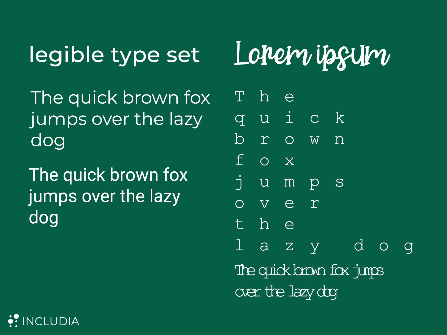
Font Legibility: The primary goal of accessible fonts is to ensure legibility. This means that the characters in the font are easy to distinguish from one another, even at small sizes or low resolutions. Simple, clean letterforms with well-defined spacing are essential for legibility. Avoid fonts with overly decorative or complex design elements, as they can hinder readability.
-
Size and Spacing: Adjustable font size and letter spacing are crucial for users with low vision or reading difficulties. Accessible fonts should allow users to resize text without loss of quality or readability. Adequate letter and line spacing also help prevent text from appearing cramped, making it easier to read.
-
Color contrast: The contrast between the text and the background is vital for readability, especially for individuals with visual impairments. Accessible fonts should have a high contrast with the background to ensure text stands out clearly. Use dark text on a light background or vice versa to maximize legibility.
-
Sans Serif Fonts: Sans-serif fonts, such as Arial, Helvetica, and Open Sans, are generally more accessible than serif fonts for on-screen content. They have clean, simple lines and do not have the decorative serifs that can create visual distractions.
-
Consistency: Consistency in font choice and formatting throughout a document or website contributes to accessibility. Avoid using too many different fonts and styles, as this can be confusing for users with cognitive disabilities.
-
Compatibility with Assistive Technologies: Accessible fonts should work seamlessly with screen readers and other assistive technologies. Properly encoded fonts with accurate metadata enable assistive technologies to interpret and vocalize text correctly.
-
Unicode Support: Ensure that fonts support a wide range of Unicode characters, including special symbols, punctuation, and foreign languages, to enable global accessibility.
HIGHLY RECOMMENDED FONTS
- Sofia Pro (sans serif)
- Pluto Sans Heavy (sans serif)
- Andika (sans serif) Calibri (sans serif)
- Century Gothic (sans serif)
- Trebuchet MS (sans serif)
- Times New Roman
- Garamond (sans serif)
- Bookman Old Style (serif)

Conclusion
Accessible fonts help create a more inclusive digital environment where all users, regardless of their abilities, can access and understand content effectively. When designers and developers prioritize accessibility in font choice and usage, they contribute to a more inclusive and equitable online experience for all.