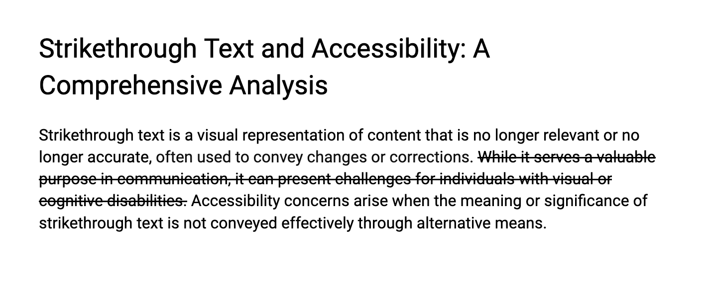
Strikethrough text is a visual representation of content that is no longer relevant or no longer accurate, often used to convey changes or corrections. While it serves a valuable purpose in communication, it can present challenges for individuals with visual or cognitive disabilities. Accessibility concerns arise when the meaning or significance of strikethrough text is not conveyed effectively through alternative means.
Some Common Use Cases of Strikethrough Text
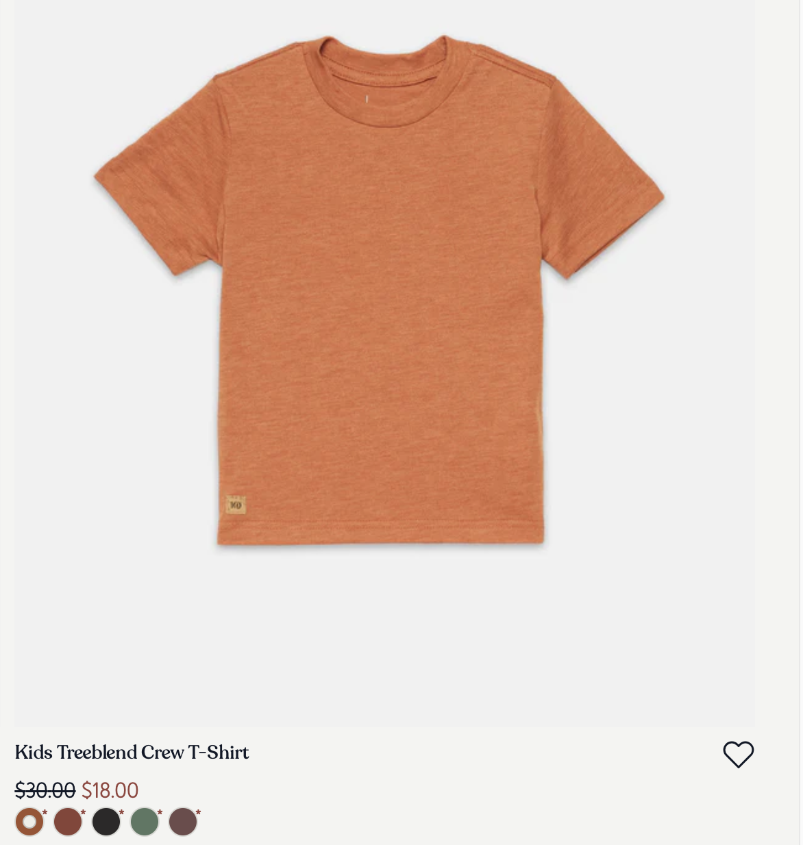
Displaying Previous Prices in E-Commerce Sites
Strikethrough text is often used to show the original price of a product before a discount is applied. This practice is prevalent in e-commerce to highlight the cost savings and attract the attention of potential buyers.
Price Comparisons
Beyond e-commerce, strikethrough text is used in various scenarios to emphasize discounts or special offers. This can include price comparisons in advertisements, subscription plans, or any situation where a reduction in cost is being communicated.

Version Control in Software Development
In the context of coding and software development, strikethrough text is often used to indicate deprecated or obsolete code. This helps developers understand which parts of the codebase are no longer in use or recommended for future development.
Tracking Document Changes
In collaborative writing environments or document editing software, strikethrough is a standard way to indicate deleted or modified content. It provides a visual cue for authors and editors to track changes during the revision process.
Amendments in Legal Documents and Contracts
In legal documents, contracts, or agreements, strikethrough text is commonly used to indicate amendments or modifications to the original text. This ensures transparency and helps all parties involved understand the changes made.
Is Strikethrough Text Accessible?
Unfortunately, there isn’t a simple way to make strikethrough text accessible. It’s best to avoid using strike-through in this context altogether or rewrite the content. This is because screen readers typically ignore the strikethrough decoration, causing the text to be read aloud without any indication of the strikethrough. Additionally, users relying on screen magnification or those with low vision may find it challenging to discern the crossed-out text or understand its content. Individuals with cognitive disabilities may also face difficulties in processing and comprehending the meaning of strikethrough text.
The Challenge of Strikethrough Text
Lack of Visual Recognition
For users relying on screen readers, the inherent visual nature of strikethrough text poses a recognition barrier. Screen readers may struggle to interpret the visual styling, potentially leading to an incomplete or inaccurate representation of the content. This raises concerns about missed meaning and comprehension gaps for individuals with visual impairments.
Contextual Ambiguity
Strikethrough text may not inherently provide enough contextual information for users with cognitive disabilities. This can result in confusion regarding the intent behind the modification or deletion, impacting the overall comprehension of the content. The challenge lies in ensuring that the meaning behind strikethrough text is clear and accessible to a diverse range of users.
Cognitive Load
Users with cognitive disabilities may experience an increased cognitive load when processing the significance of strikethrough text, particularly if the context is unclear or if there are multiple instances in a given content. This emphasizes the need for a user-friendly approach that minimizes cognitive strain and enhances the overall accessibility of the information presented.
Semantic Markup with <del>, <s> and <ins> Elements
<s>element: Represents content that are no longer relevant or no longer accurate.<del>element: Represents a range of text that has been deleted from a document.<ins>element: Represents a range of text that has been added to a document.
Insertion and Deletion ARIA Roles
Using the <ins> and <del> elements will automatically communicate that a section has the role of insertion or deletion. If possible, prefer using these semantic HTML elements.
However, if necessary, you can wrap an element with role="deletion" or role="insertion" to convey the same semantics.
Screen reader support
Accessibility for strikethrough text can differ among various screen readers. The following outlines how different screen readers announce distinct strikethrough elements.
| Element | JAWS | NVDA | Narrator | VO on macOS | VO on iOS |
|---|---|---|---|---|---|
<del> |
deletion/end deletion | deleted | none | none | deletion |
<s> |
none | deleted | none | none | none |
<ins> |
insertion/end insertion | inserted | none | none | insertion |
role="deletion" |
none | deleted | none | none | deleted |
role="insertion" |
none | inserted | none | none | insertion |
Strategies for Making Strikethrough Text More Accessible
Visually hidden text
By incorporating visually hidden text alongside your strikethrough element, you provide additional information to screen readers without affecting the visual layout for sighted users. This method ensures that users relying on screen readers receive a comprehensive understanding of the content.
<p>
  <del>
    <span class="sr-only">Original price: </span>
    $19.99
  </del>
  <ins>
    <span class="sr-only">Discount price: </span>
    $9.99
  </ins>
</p>
Use aria-label
The aria-label attribute is a valuable tool to provide alternative text for assistive technologies. Applying aria-label directly to the strikethrough element enables you to convey the meaning or context of the strikethrough content.
<p>
  <del aria-label="Original price: $19.99">$19.99</del>
  <ins aria-label="Discount price: $9.99">$9.99</ins>
</p>
Use aria-describedby
Similar to aria-label, the aria-describedby attribute allows you to associate additional information with the strikethrough text. This can be particularly useful for providing more context or details regarding the crossed-out content.
<p>
  <span id="original-price">Original Price: </span>
  <del aria-describedby="original-price">$19.99</del>

  <span id="discount-price">Discount Price: </span>
  <ins aria-describedby="discount-price">$9.99</ins>
</p>
Use CSS Generated Content
Leveraging CSS generated content is another approach to enhance the presentation of strikethrough text. By using the ::before or ::after pseudo-elements, you can insert additional content that is only perceptible to screen readers, offering more descriptive information about the strikethrough
.original-price::before {
    content: "Original Price: ";
    position: absolute;
    clip: rect(0 0 0 0);
}

.discount-price::before {
    content: "Discount Price: ";
    position: absolute;
    clip: rect(0 0 0 0);
}
<p>
  <del class="original-price">$19.99</del>
  <ins class="discount-price">$9.99</ins>
</p>
Use 'aria-hidden' attribute for decorative strikethrough
For decorative strikethrough that doesn't convey meaningful content, applying the aria-hidden="true" attribute helps inform assistive technologies that the strikethrough is purely presentational and doesn't carry semantic meaning. This ensures that screen reader users aren't confused by unnecessary information.
<p>
  Today is <del aria-hidden="true">Monday</del> Friday.
</p>
Avoid Using CSS to Style Strikethrough Text
CSS-based strikethrough may lack semantic meaning and could be missed by screen readers. It's recommended to use HTML elements and attributes to ensure proper accessibility.
Color Contrast Considerations
Ensure sufficient contrast between the strikethrough text and its background. This is particularly important for users with low vision or color blindness. Experiment with color choices and consider providing users with the option to customize the styling for better readability.
Bad Example:
.strikethrough {
    text-decoration: line-through;
    color: red;
}

.strikethrough-text {
  color: blue;
}
<p>
  Today is
  <span class="strikethrough">
    <span class="strikethrough-text">Monday</span>
  </span>
   Friday.
</p>
Better Example:
.strikethrough {
    text-decoration: line-through;
    color: #a60202;
}
<p>
  Today is <span class="strikethrough">Monday</span> Friday.
</p>
Don't Use Unicode Strikethrough Text
Avoid using unicode characters for strikethrough text. While they may visually appear as strikethrough, they often lack proper semantic meaning and may not be recognized by screen readers, leading to an incomplete or confusing experience for users relying on assistive technologies.
Bad Example:
<p> This is a bad s̶t̶̶̶r̶̶̶i̶̶̶k̶̶̶e̶̶̶t̶̶̶h̶̶̶r̶̶̶o̶̶̶u̶̶̶g̶̶̶h̶̶̶ ̶̶̶t̶̶̶e̶̶̶x̶̶̶t̶̶̶.̶̶̶</p>
Conclusion
In conclusion, although strikethrough text is effective for communicating changes or corrections, its visual nature presents challenges for users with vision deficiencies and users with cognitive disabilities, potentially leading to contextual ambiguity.